
Sinclair Broadcast Group
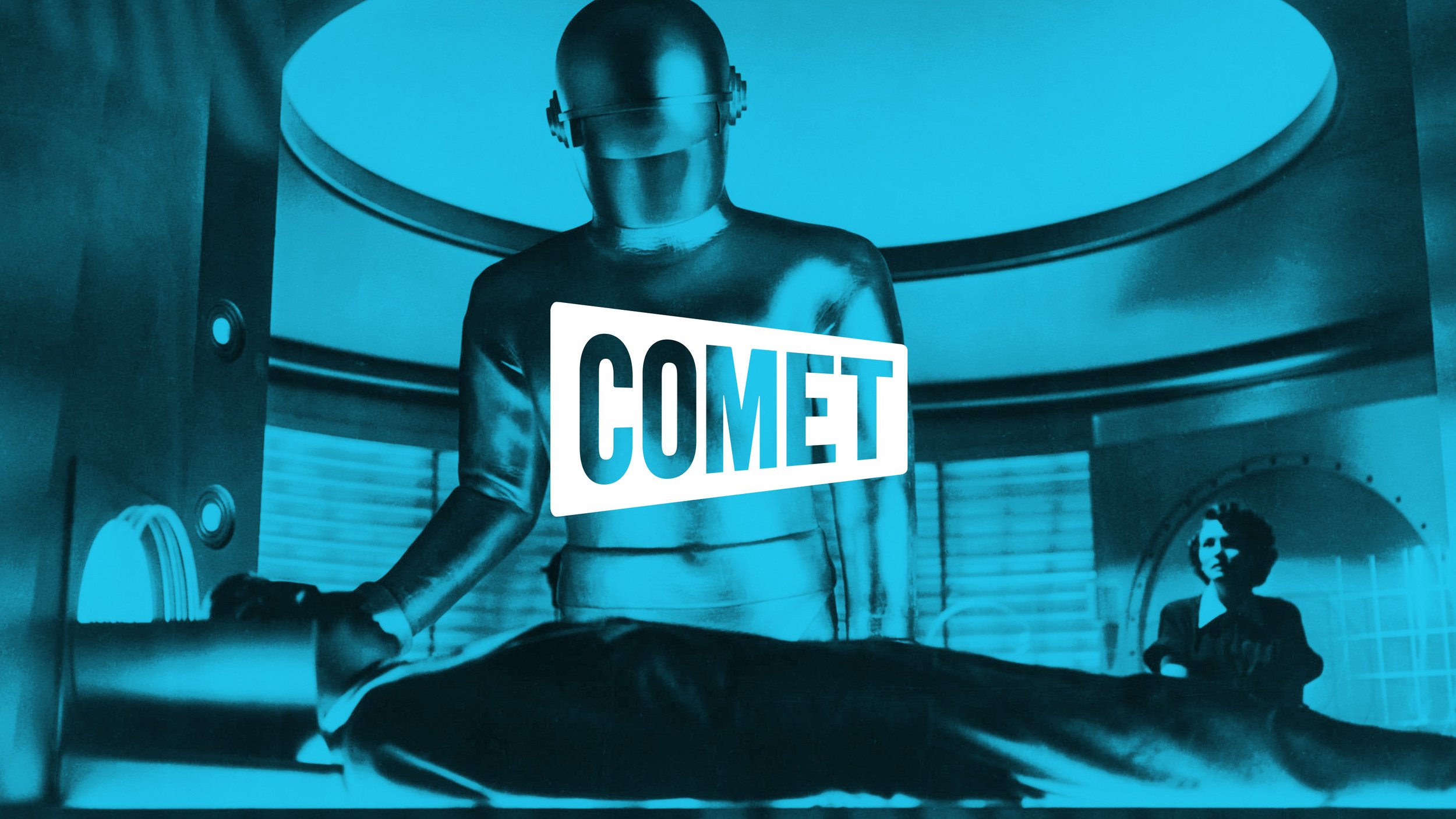
COMET REBRAND
-
Jumpstart a sci-fi TV channel that’s hit a wall—in both viewer & revenue growth.
-
Transform a bargain brand into a challenger brand—the scrappy, authentic underdog:
Differentiate sharply from the mainstream, “establishment” competitor—appealing to its disgruntled viewers & offering Comet as the “answer.”
Up the visual style to put the brand on equal footing with top-tier cable channels.
But ensure the brand stays quirky & never takes itself too seriously.
Avoid losing existing viewers—some of whom like the existing brand.
-
A quirky, odd brand that’s firmly rooted in the original—but sleeker & cooler.
Cleaner, more streamlined logo (since we weren’t permitted to make a completely new one).
Brighter, more stylish color-accent palette—with clear usage guidelines.
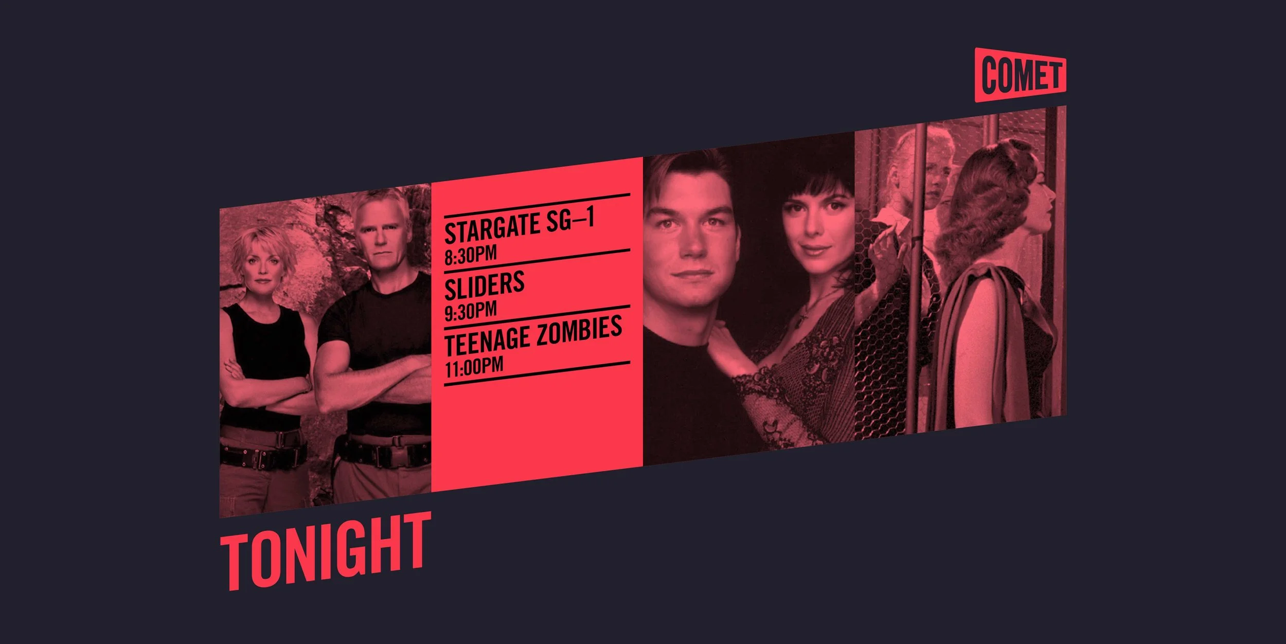
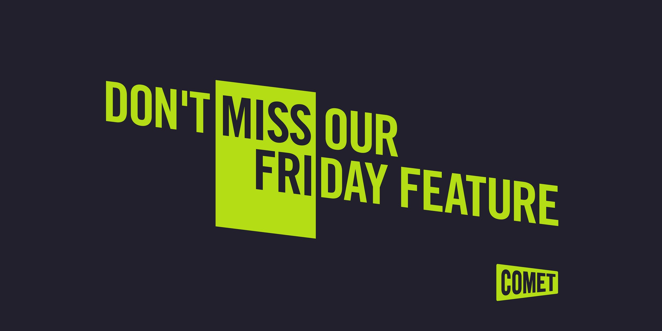
Striking new visual vocabulary—elements which have become the new brand’s “signatures”:
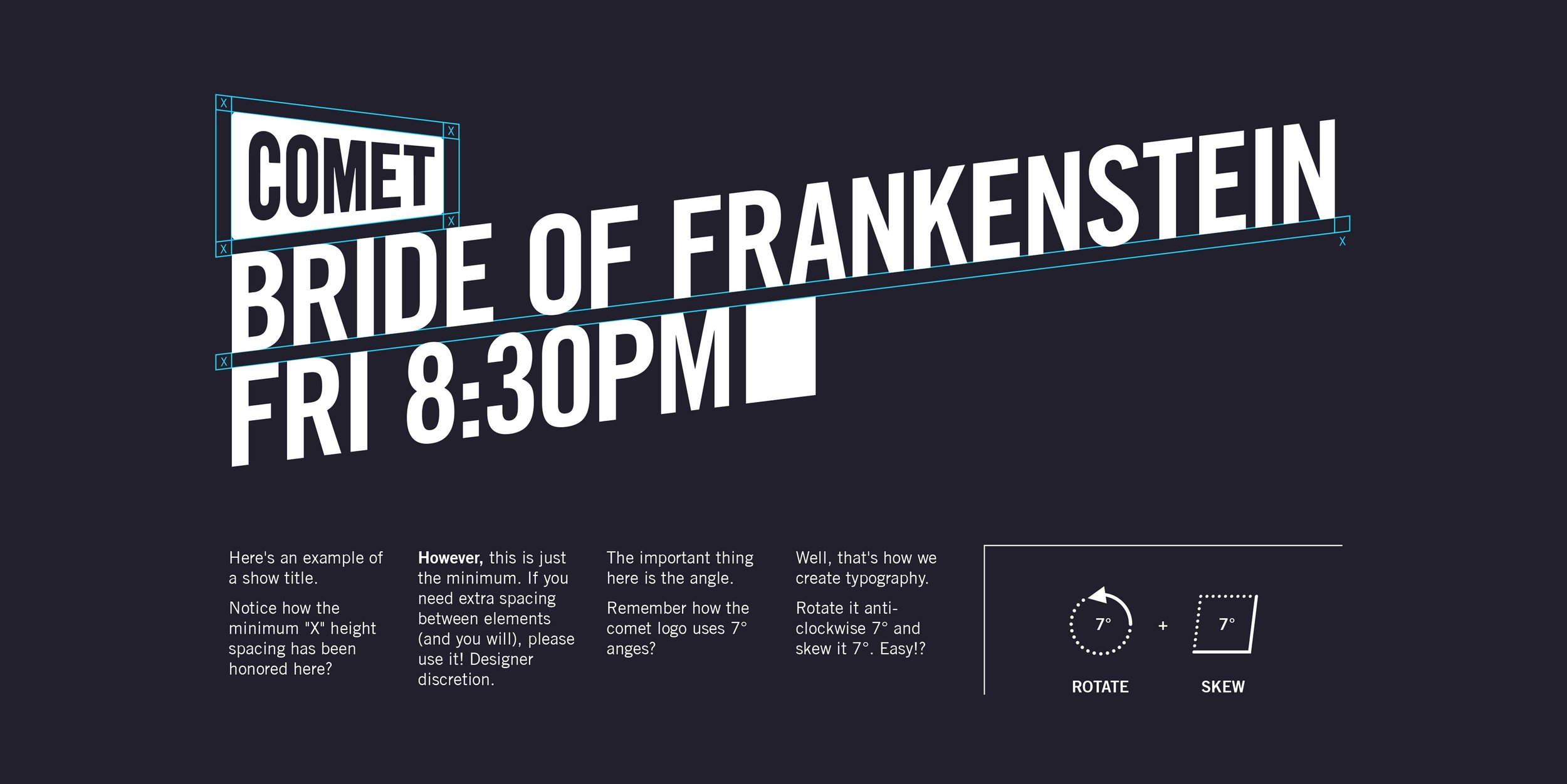
Powerfully tilted headlines—always at 7°.
Old-school MS-DOS cursor—a nod to kitschy vintage sci-fi that serves as a transitional element in motion graphics.
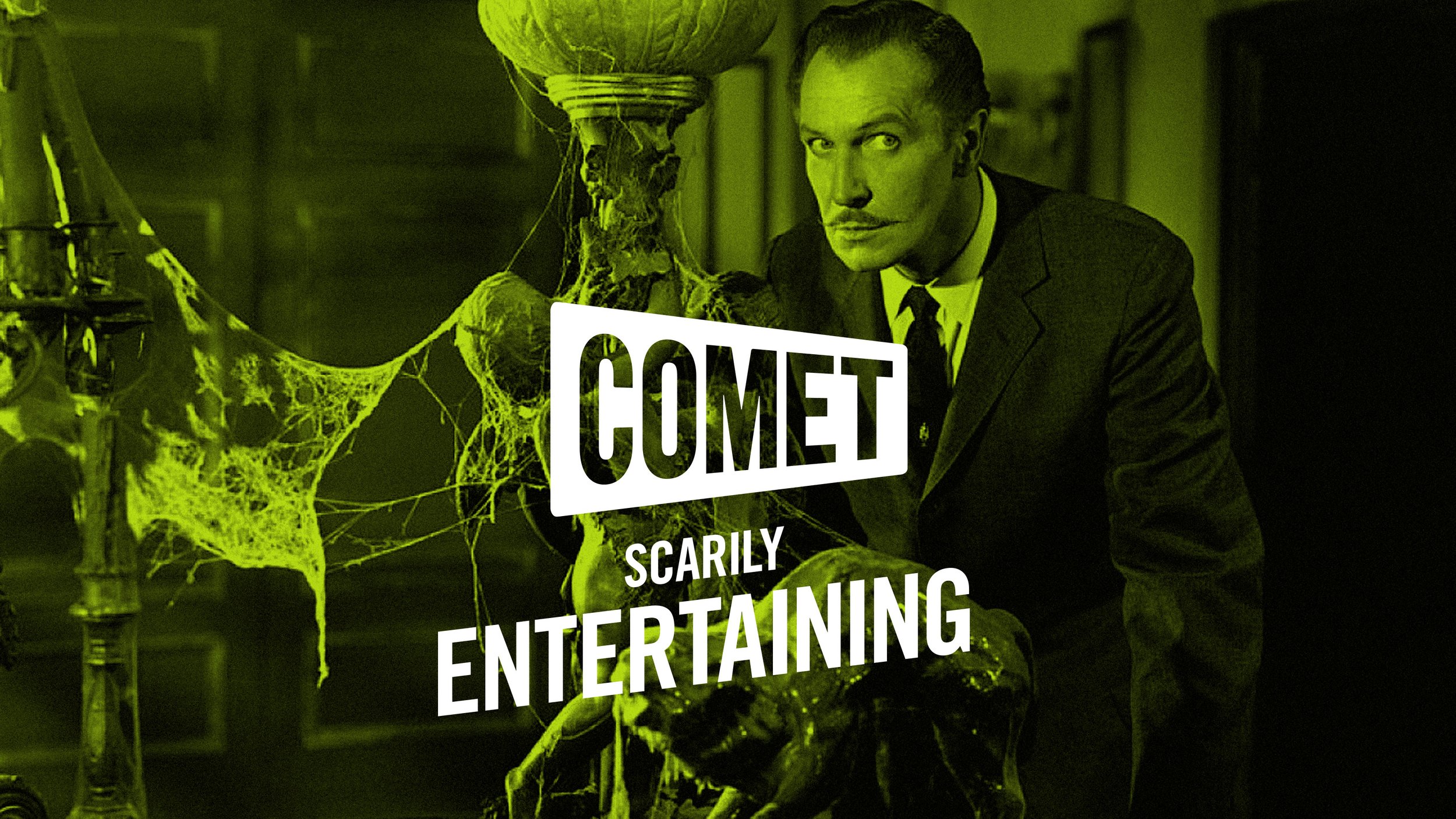
New positioning that celebrates the brand as the “cooler alternative”—less predictable, less corporate, less rule-bound: the naughty younger brother.
Authentic voice—one that’s quirky & offbeat, yet quietly confident—the nerd who’s cool with being a nerd.
The “dual tonality” speaks both to the nostalgic, older “comfort zone” crowd while also resonating with a hip, younger “retro-cool” crowd that’s there for the kitsch.
-
New brand concept & evolved story
New visual identity system
New Brandbook