

City of West Hollywood
THE WEHO PICKUP REBRAND
-
Bring that “new car smell” to a beloved City brand—while staying true to what made it special in the first place.
-
Keep the brand’s original ingredients:
Festive energy.
In-your-face colors.
WeHo characters.
But evolve these ingredients to something newer & more modern…
-
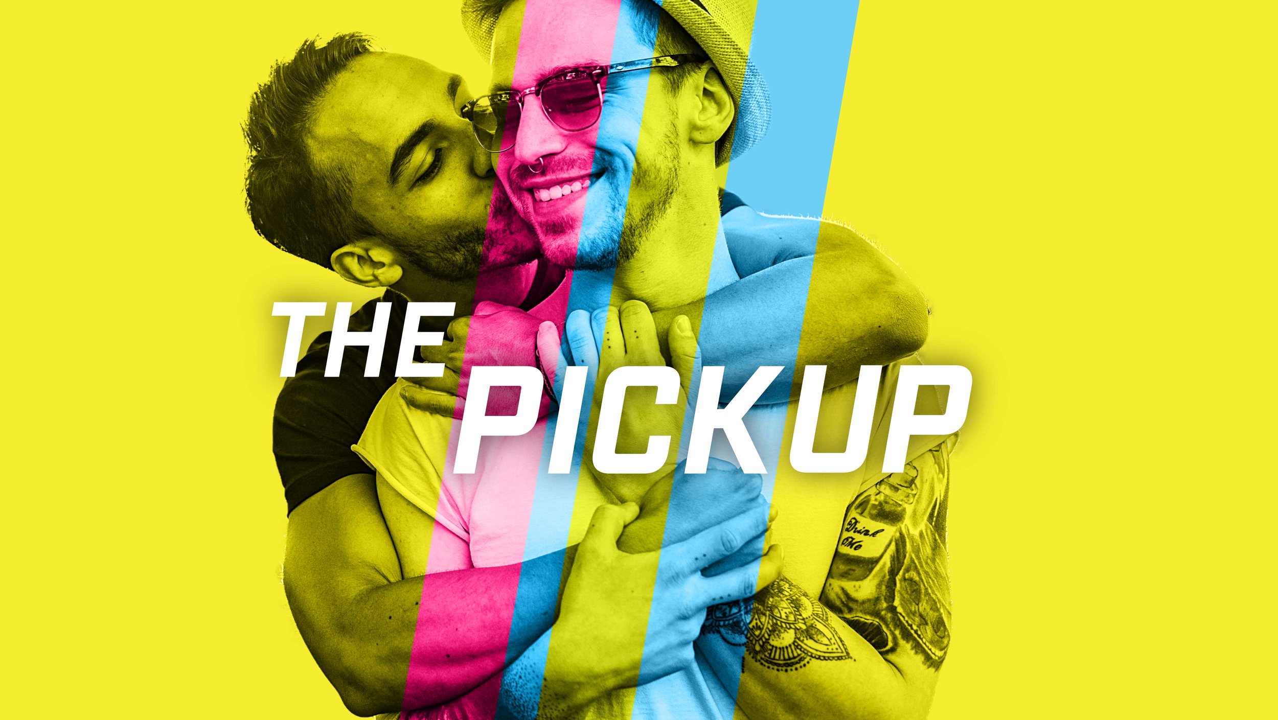
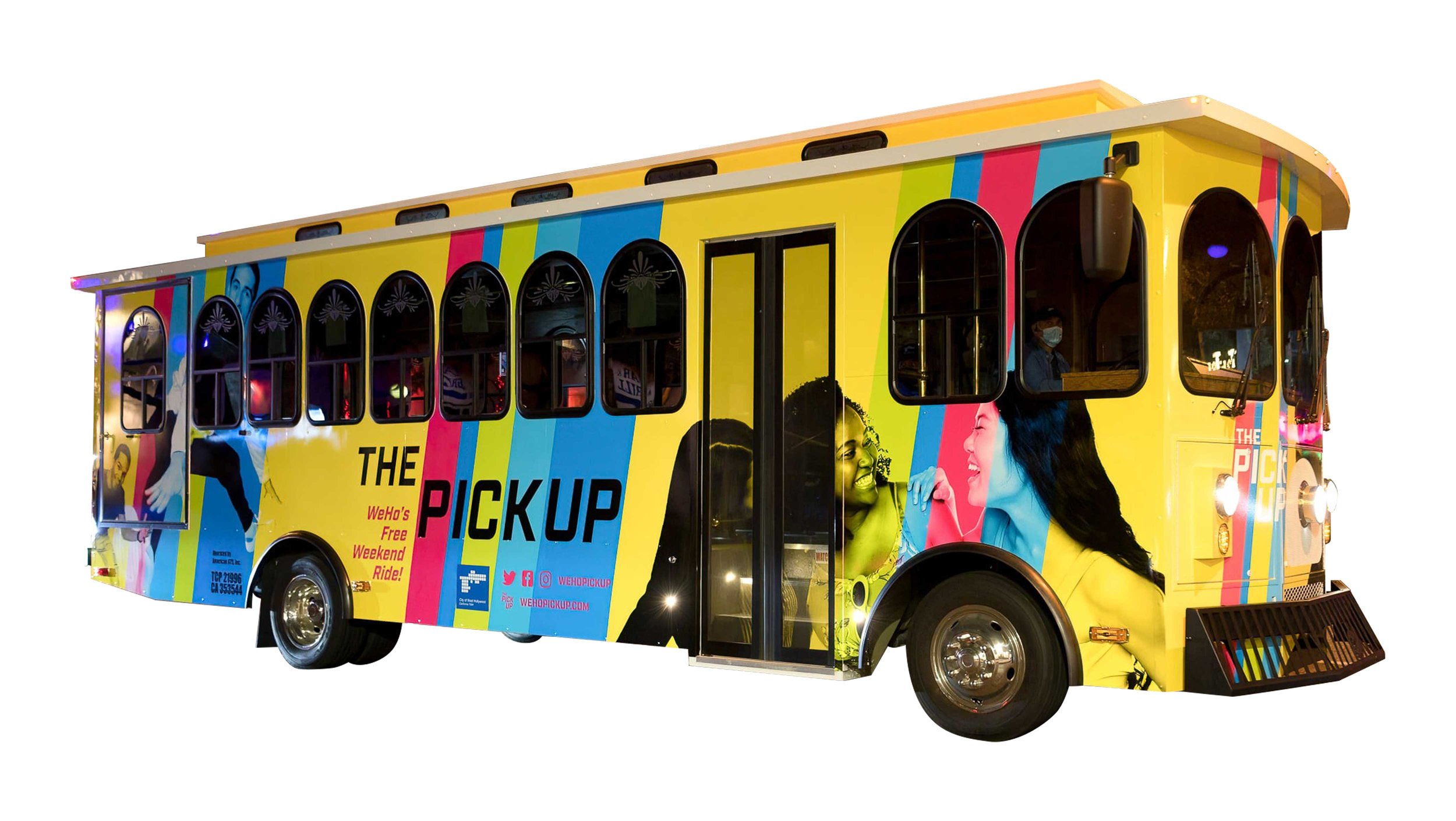
A bold new look that pays homage to the past while bringing the brand to the here and now:
Logo
Still high-energy—but streamlined.
Colors
Main color is still yellow, but a slightly cooler hue.
Accent colors are still aggressive, but evolved from the primary palette to more distinctive ensemble.
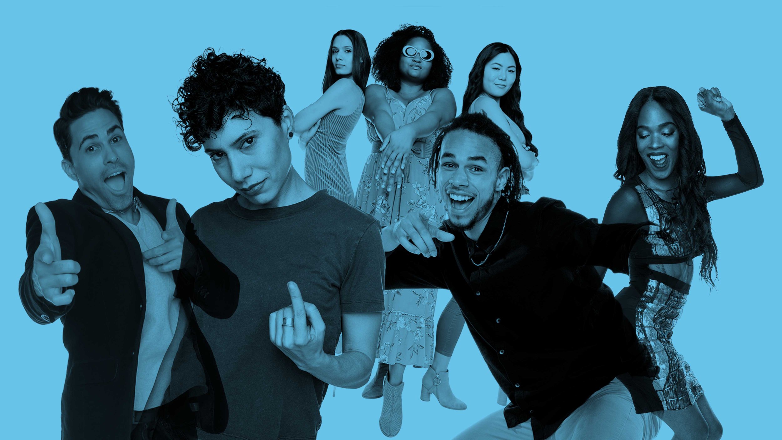
Characters
Transformed from comicbook, “Roy-Lichtenstein” characters to real people.
Recast to reflect greater diversity— in terms of:
Age
Race
Gender identity
Body type
Sexuality
The cast of characters was huge & the shoot lasted 2 days—one of our biggest still-photography shoots.
-
Brand concept & story
Visual identity system
Brandbook
Website
Experience design
Ongoing promotion
Social media
Advertising
Events